Over the past few months, the KHC team has been developing numerous COVID-19 resources for our community members, healthcare stakeholders, employers, and more. Along with the COVID-19 Testing Employer Resource Guide, the KHC recently developed a dashboard that displays COVID-19 data specific to the Kentuckiana region. While data is readily available at the state and county level, few resources exist reporting on how COVID-19 is affecting Kentuckiana. To mend this, the KHC team developed a dashboard that provides a snapshot of how COVID-19 is impacting the region. Kentuckiana as defined by the KHC consists of the seven counties included in the former Louisville metropolitan statistical area (MSA). This includes Kentucky’s Jefferson, Oldham, and Bullitt counties and Indiana’s Floyd, Clark, Harrison, and Scott counties. The dashboard, which is available on the COVID-19 Resources page, includes graphs of cumulative case rates as well as new cases per day presented at the county level. Presented below is a snapshot of the dashboard.
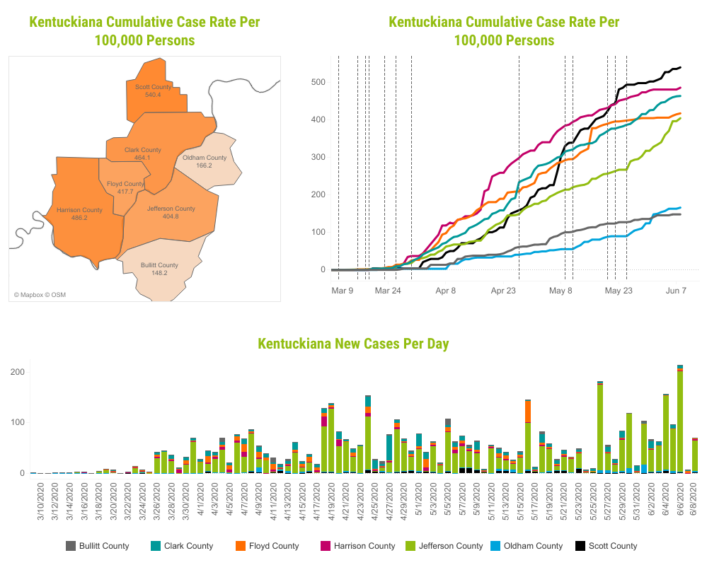
On the bar graph, users will find the number of new cases per day for each county. The graph is helpful in seeing peaks, trends, and differences among counties. For instance, Jefferson County has continuously reported a higher number of new cases compared to other counties. When viewing this graph, users should be mindful of factors contributing to variability between days including when cases are reported and when test results are available in each county.
The dashboard also includes a map and line graph presenting cumulative case rates per county. By viewing the map, users may notice the stark difference in case rates between counties; all of Indiana’s counties – Harrison, Floyd, Clark and Scott – have higher rates of COVID-19 than Kentucky’s counties. The line graph includes both cumulative case rates over time and information on key COVID-19-related events for Kentucky. Hovering over any of the vertical lines will display descriptions of these events. For more county-specific breakdowns of data and key events pertaining to Indiana, visit https://covidkentuckianadata.com/.
By viewing the dashboard, users will gain a better understanding of how COVID-19 is not just impacting Kentucky or Indiana, but how it is affecting Kentuckiana counties both distinctively and as a whole. The dashboard will be updated regularly so users should check back often to stay informed.